If you like to use the WordPress default themes but don’t like the generic look, you can easily customize the theme with some CSS. The most current default WordPress theme is geared more to websites than a blog. I’m going to show you how you can customize WordPress theme Twenty Seventeen specifically for blogging. If you are new to WordPress, you may want to check out my post on starting a website first.
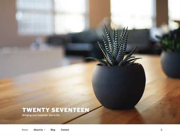
Out of the box, Twenty Seventeen has some great features for a website. The ability to have a full screen header image, with sticky top navigation, can be a big plus for designing a business website. But what if you want to use this theme for a blogging platform?
Customize WordPress Theme Twenty Seventeen
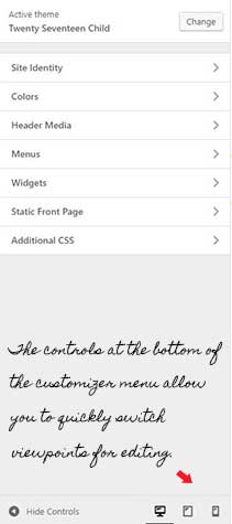
For a blog, I like to show a little more detail above the fold. Even though the large image is great for a business landing page, it takes up a lot of crucial real estate. Some of the other features that I do like with this theme include it’s accessibility, responsiveness and easy customizer page. The customizer page lets you view the site in three screen sizes: pc, tablet and phone. So as you are adding your own CSS, you can see the changes on all three viewpoints by just clicking through the viewpoints. This makes it even easier and quicker to customize the theme.
Why You Would Need A WordPress Child Theme
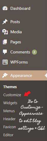
Sometimes you will need to edit the template files for things that you can’t change with CSS. Before making any changes to the template files, you will want to create a child theme. That way, your changes will stay in place even when the parent themes files go through an update. If you don’t know how to create a child theme, visit wordpress.org – child themes for a complete tutorial.
Some Ways To Customize The Twenty Seventeen Theme With CSS:
Change the height of the header image on computer screen view.
One of the first things you can do to make the theme more blog friendly is to reduce the height of the header image to allow for more viewable items above the fold. This blogging tip will help with usability. To show the header image at 50% of the height, change the code under the viewport of @media screen and (min-width: 48em). Copy the following code:
/*To change the height of the header image*/

.twentyseventeen-front-page.has-header-image .custom-header-media,
 .twentyseventeen-front-page.has-header-video .custom-header-media,
 .home.blog.has-header-image .custom-header-media,
 .home.blog.has-header-video .custom-header-media {
 height: 1200px;
 height: 50vh;
 max-height: 100%;
 overflow: hidden;}
The height of the image was changed to 50% by the height: 50vh. The original code was 100vh. The number in front of the “vh” equals the percentage of height shown. The new image will be the top 50% of the original image. If the top is not ideal, crop the image beforehand, to a more desirable view, when loaded. The original size of the header image should be 2000px x 1200px.
Remove the scroll arrow in navigation bar.
Once the header image is shortened, it’s not really necessary to have the scroll arrow since you can see further content on the screen. To remove this icon, use the following code.
@media screen and (min-width: 48em) {

.site-header .menu-scroll-down {display: none;}

}
Show just the logo and tagline and hide the site title.
If your logo is the same as your site title you may not want to show both. First make sure that the “show title and tagline” is checked under the Site Identity tab. Then, use the following code to hide just the site title.
/* To hide site title */
.site-title {display: none;}
Make the logo larger.
The original logo shows up fairly small. The default width is 300px and the default height is 80px. If you are substituting the logo for the site title, you may want to make the logo larger. You can change the size by using the selector “.custom-logo-link img” and adjusting the max-width and max-height. The following code doubles the logo in size:
/* To double logo in size */
.custom-logo-link img {max-width: 700px; max-height: 160px;}
Change the top navigation labels to be in all caps.
As a personal preference, I like to see navigation labels in all caps. This is easily changed with text-transform:
.navigation-top {text-transform: uppercase;}
Further Customizations To The Template Files
Add a header widget area.
To be able to place content, such as a banner, below the header, it is necessary to create a new widget area. This is where you definitely will be wanting to use a child theme. First copy the header.php template from the parent theme to the child theme. This can be done from your file manager on your c-panel with hosting provider. Just go to themes then parent theme and scroll to header.php. Right click and copy to your child theme.
Before making changes to the header.php, you will want to edit the functions.php template of your child theme. You should already have this template in your child theme from when you created it.
Add the following code to functions.php
function wpb_widgets_init() { register_sidebar( array( 'name' => 'Custom Header Widget Area', 'id' => 'custom-header-widget', 'before_widget' => '<div class="chw-widget">', 'after_widget' => '</div>', 'before_title' => '<h2 class="chw-title">', 'after_title' => '</h2>', ) );}add_action( 'widgets_init', 'wpb_widgets_init' );Now that the code was added, you will be able to see a new widget area in Appearance —-> Widgets. Add whatever you would like to be displayed under your header, for example the google ad code for a banner ad. Nothing will show up quite yet. It is now time to edit the header.php template. Add the following code to header.php.
<?phpif ( is_active_sidebar( 'custom-header-widget' ) ) : ?> <div id="header-widget-area" class="chw-widget-area widget-area" role="complementary"> <?php dynamic_sidebar( 'custom-header-widget' ); ?> </div> <?php endif; ?>Remove “Powered By WordPress” from the footer.
Copy the footer.php from the parent theme to your child theme and delete this line of code in footer.php:
get_template_part( 'template-parts/footer/site', 'info' );